I was tasked with redesigning an existing mobile app. For this project I chose the app RunPee, an app that tells you the ideal time to leave a theater to go to the bathroom without missing the best parts of the movie. I went through rounds of testing and research to improve the product from the original version. The redesigned version streamlines the navigation through the app from the initial home screen to the timer, the main component of the app. I also adjusted the colors for a more aesthetic and quick to read at a glance interface while retaining the dark mode required for movie theater settings.
RunPee is a family run business which updates weekly as new moves come out. The inspiration for RunPee came after watching the 2005 remake of King Kong which is three hours long. When they left the theater they thought they should tell the people queued up for the next showing what scene it would be best for them to go and pee during. While the app proves itself a helpful tool to movie lovers, the confusing navigation and hidden features caused many of my users in user testing unable to even find the timer page. Many of the buttons throughout the app are easy to miss and the pages are crowded with an abundance of text which is overwhelming to users.
Original Screens
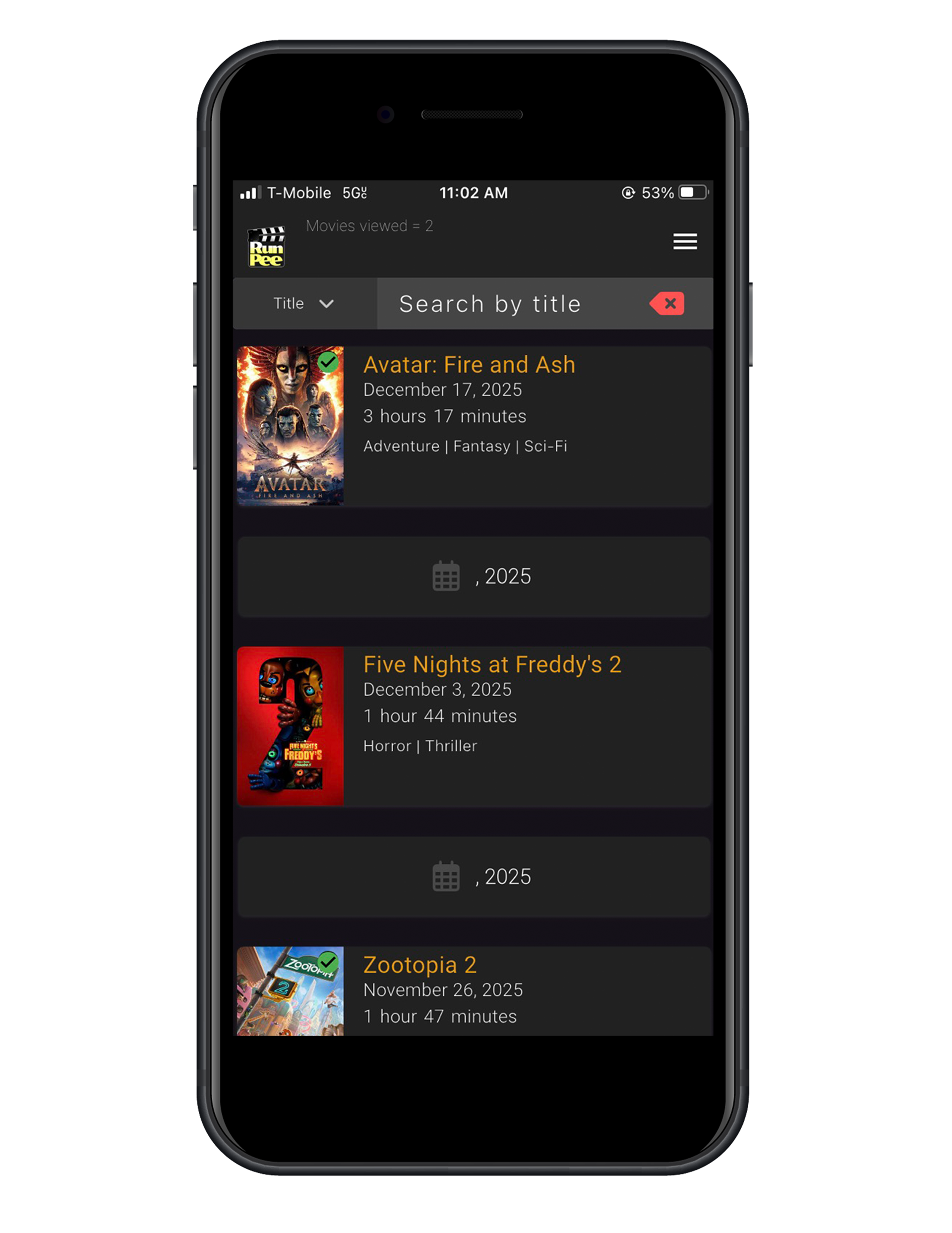
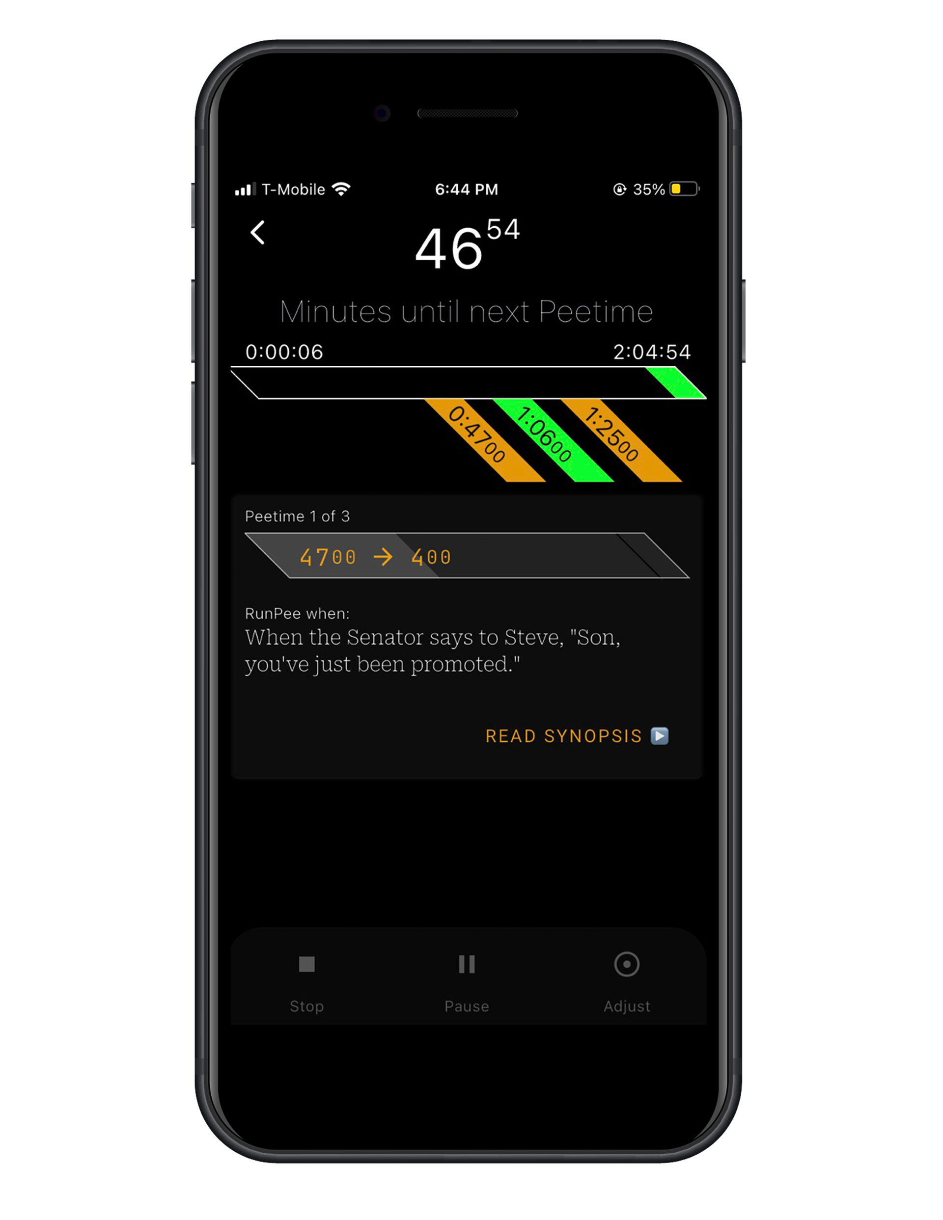
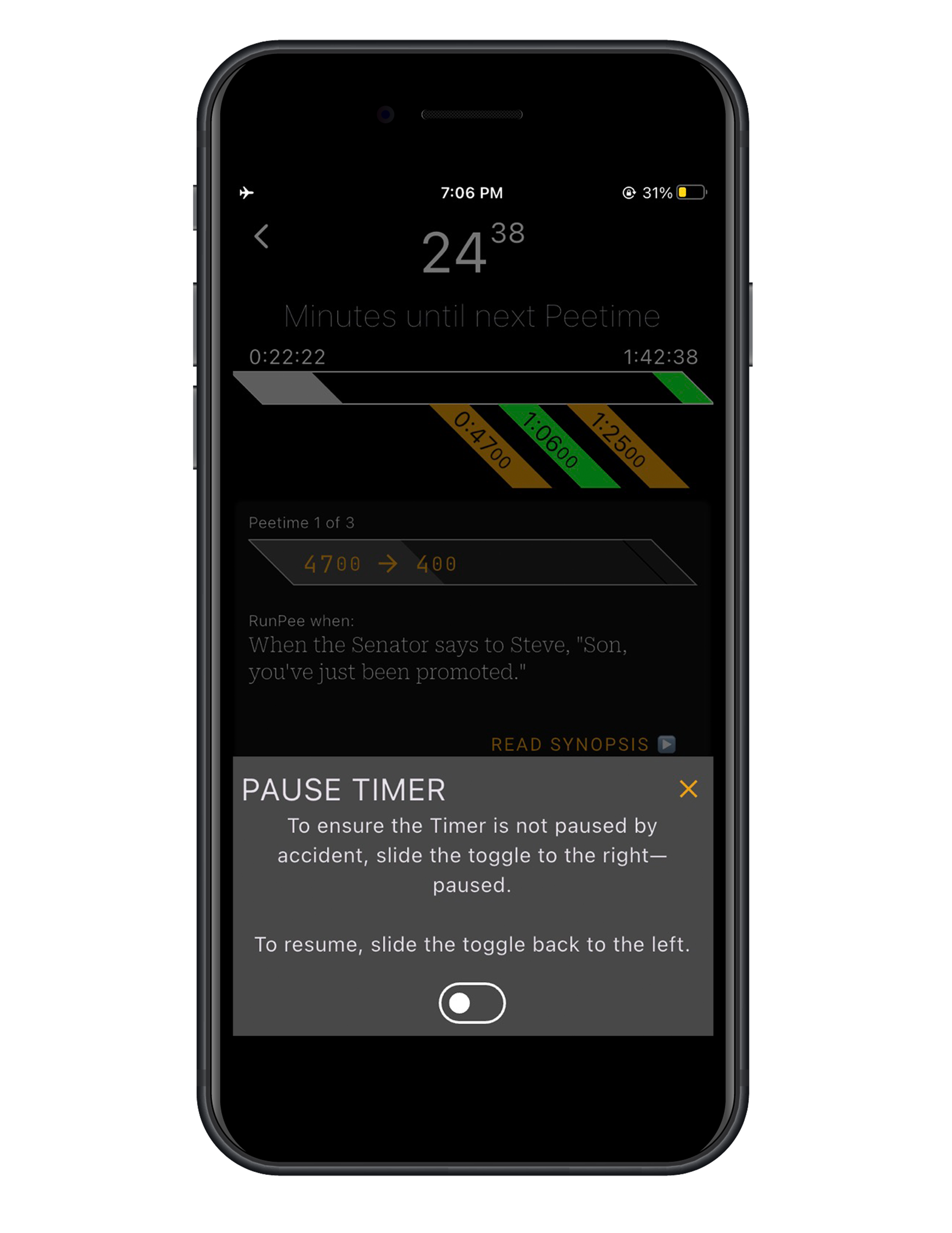
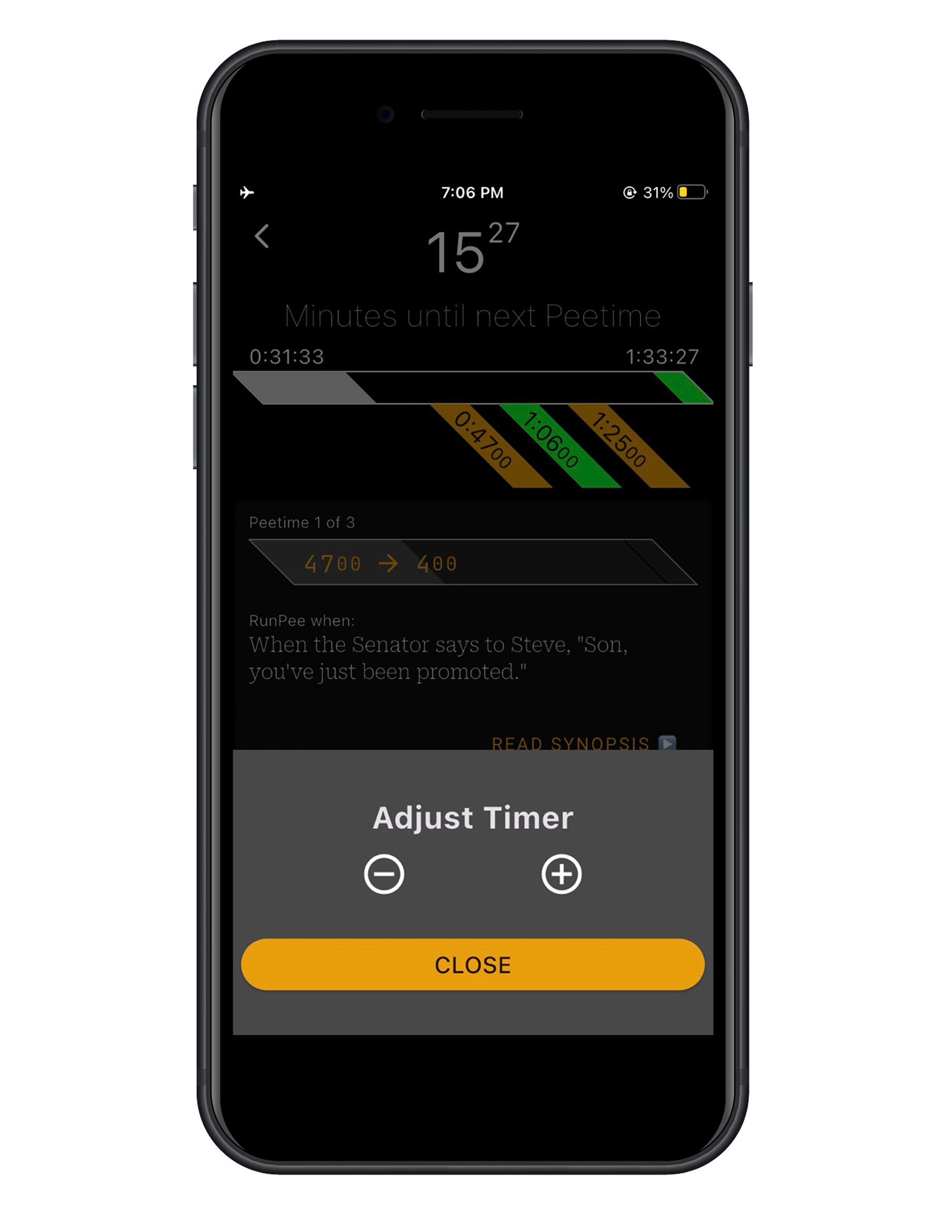
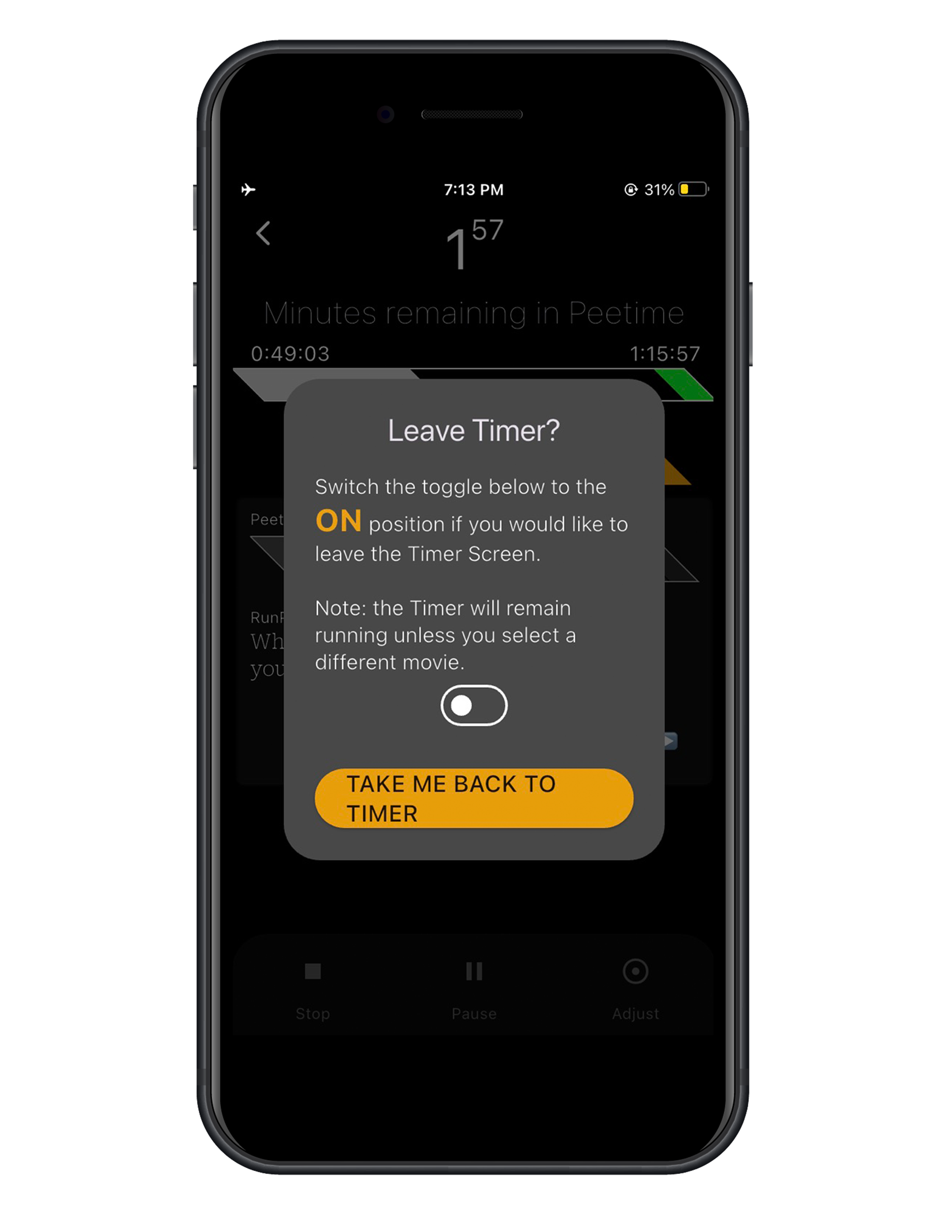
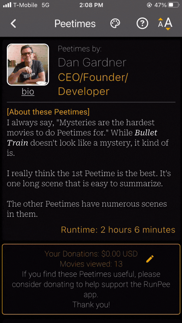
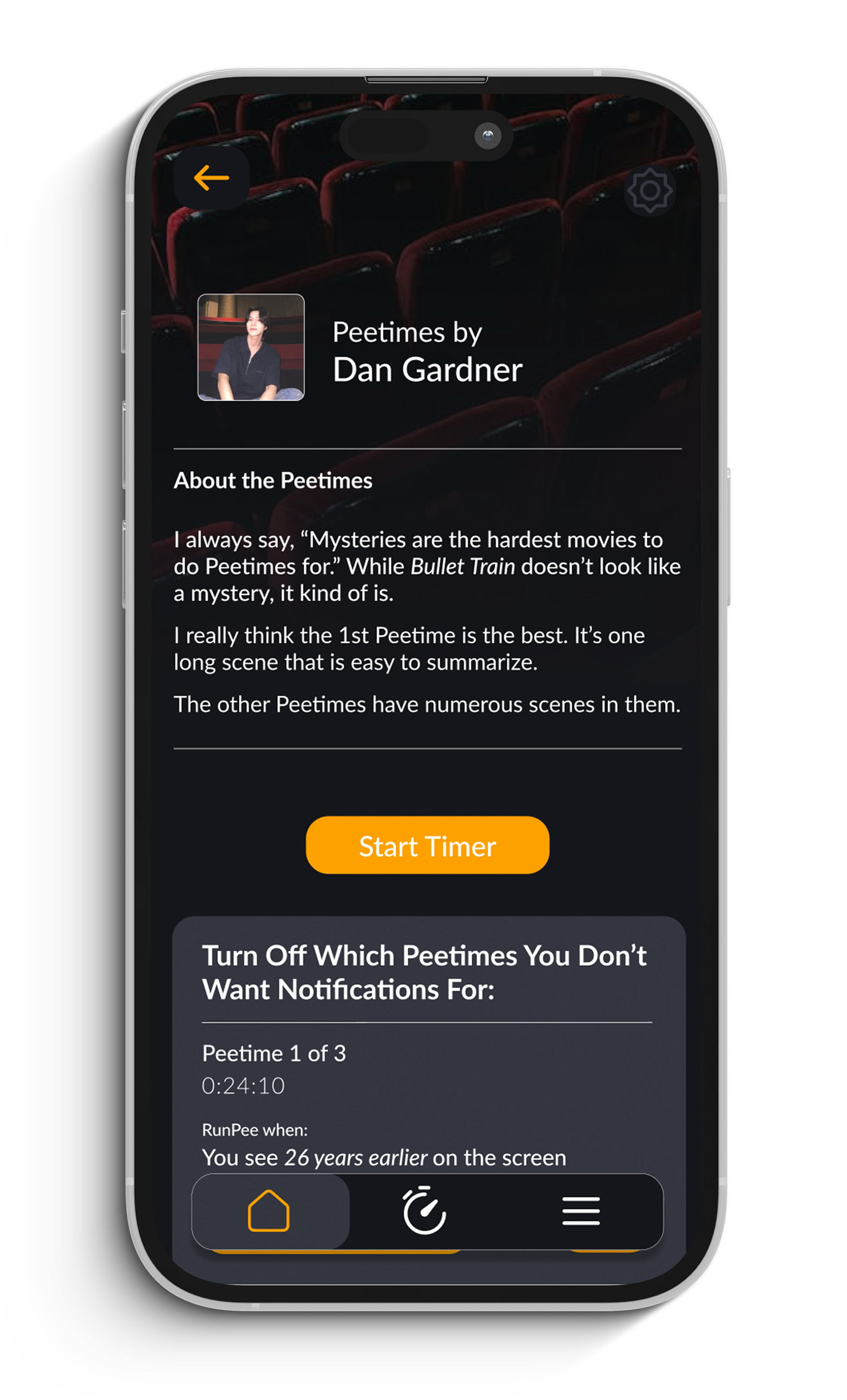
As displayed in this run through of the original app there are many crowded elements. Many of the cards displayed on the pages of this app actually function as buttons but don't match with different buttons elsewhere on the app. One main change I wanted to make was to the notification option. Multiple of my user testers couldn't find where the notifications were in the app so in my redesign I decided to add them next to the Peetimes time stamp and "read synopsis" option to both cut back on screens clicked through as well as to make them hard to miss.
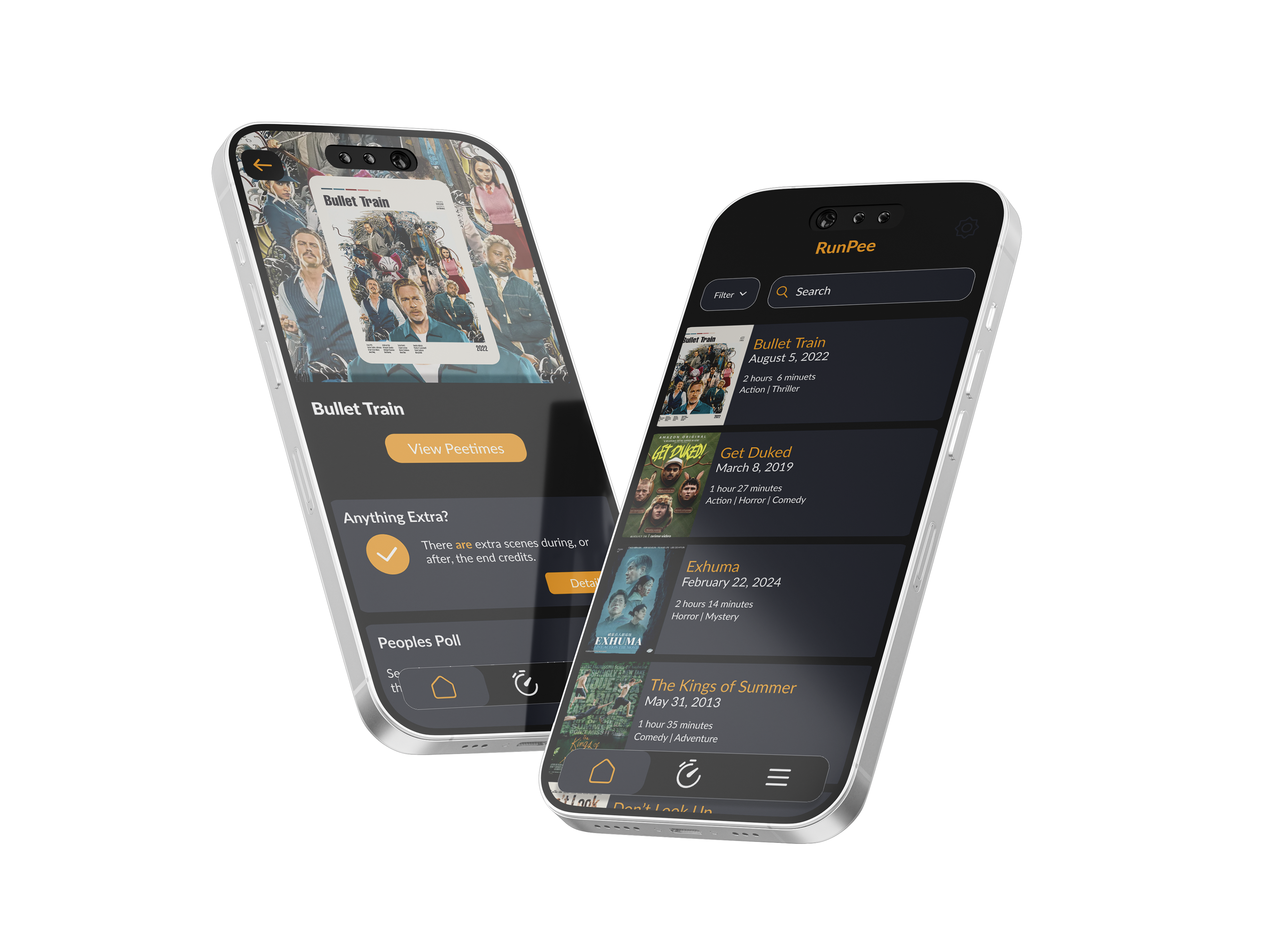
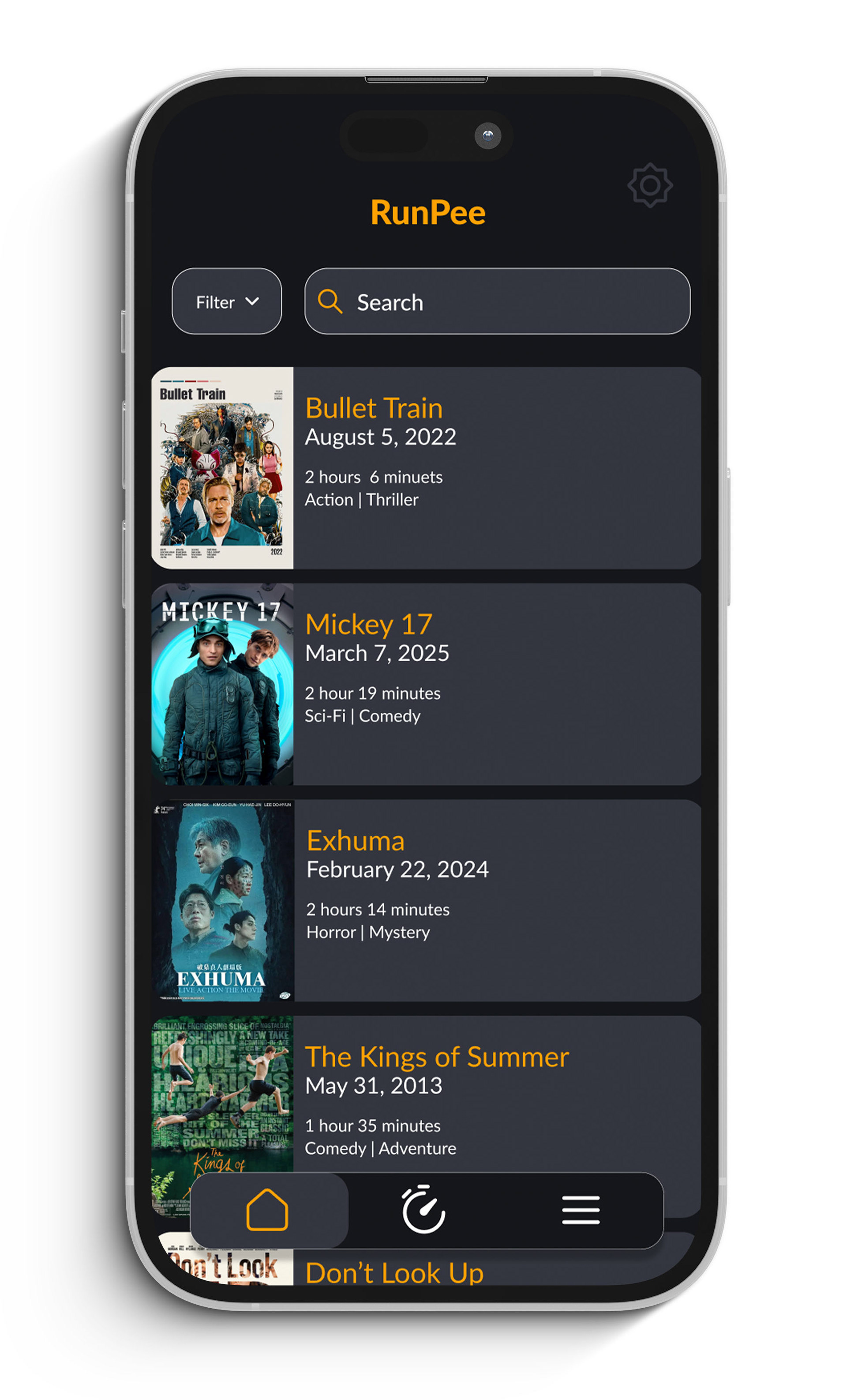
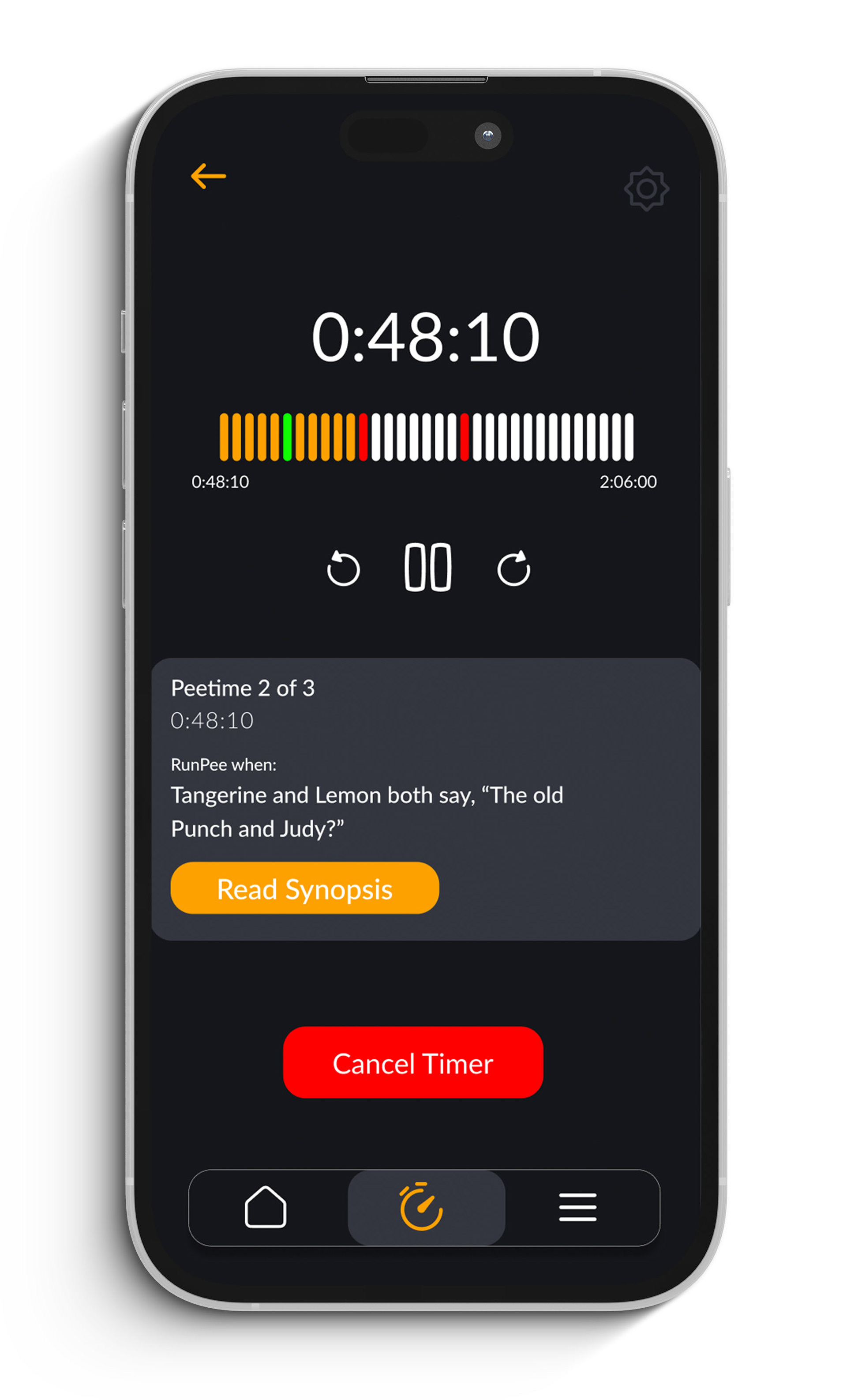
My goal while redesigning this app was to simplify the navigation to the main component of the app, the timer page. When users download this app they mainly want to know what times it will be worth it for them to leave the theater. This is the user's main goal so I wanted to make it as easy as possible for them to get there. So I made sure to reduce the amount of total pages it took to get from the movie page to the timer page by prioritizing the important information.
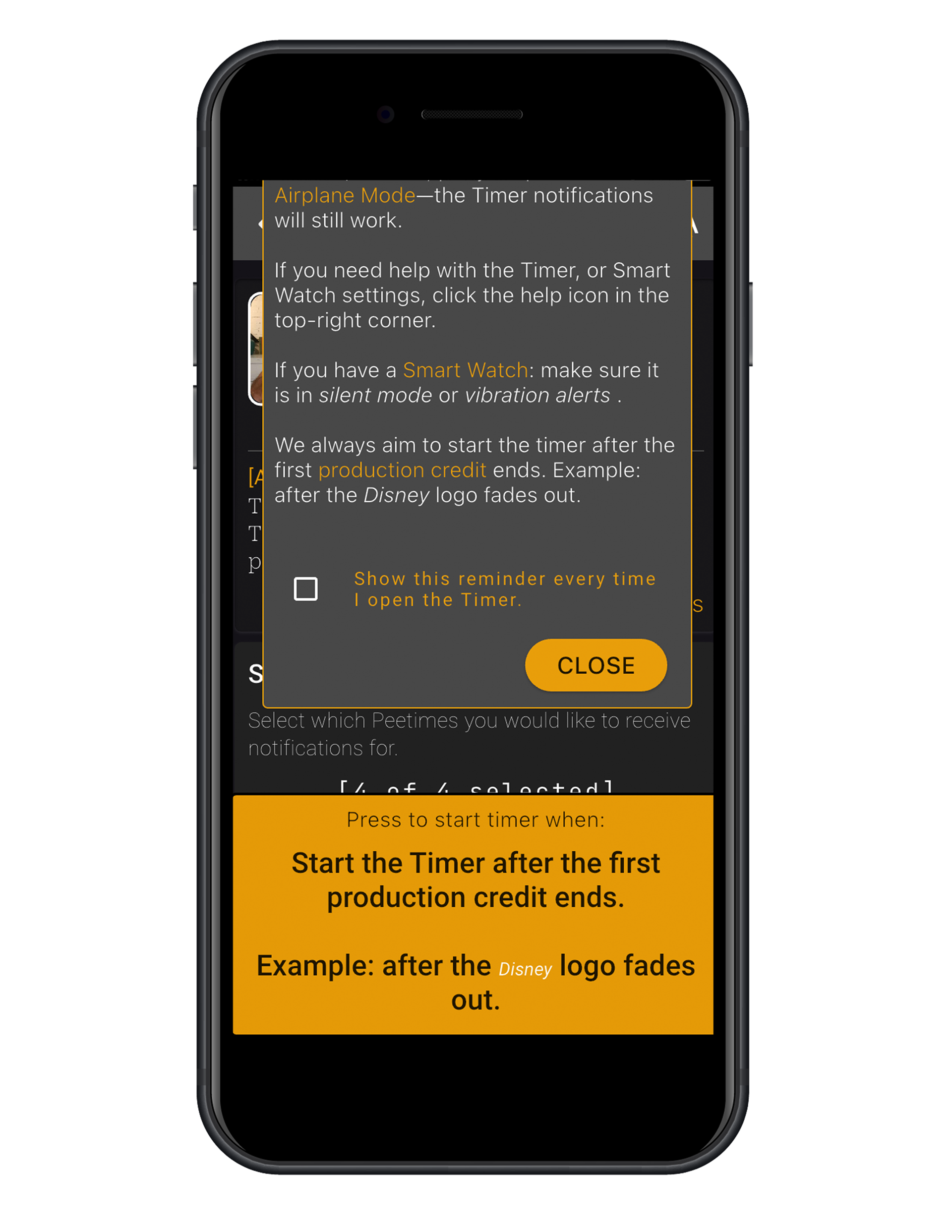
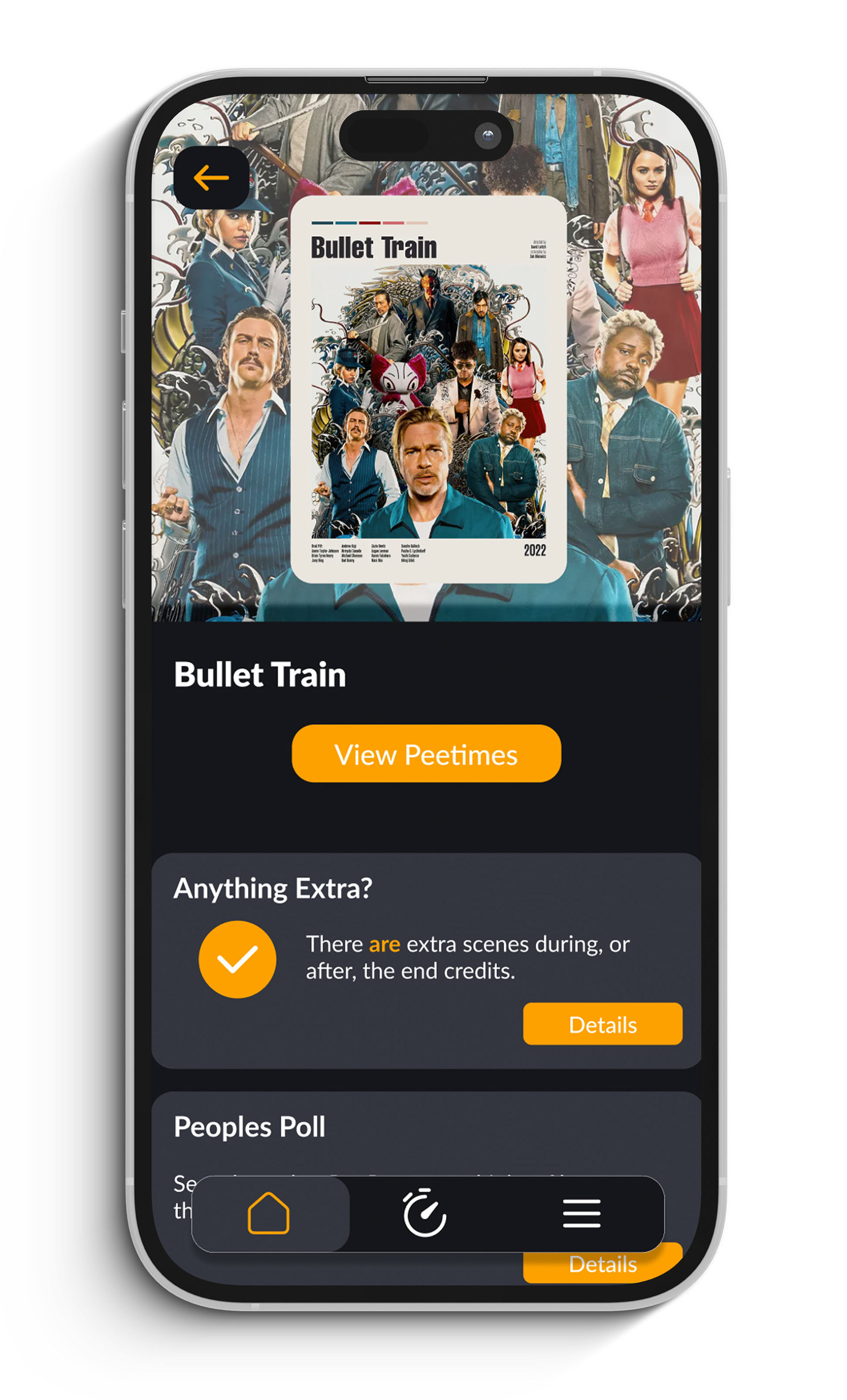
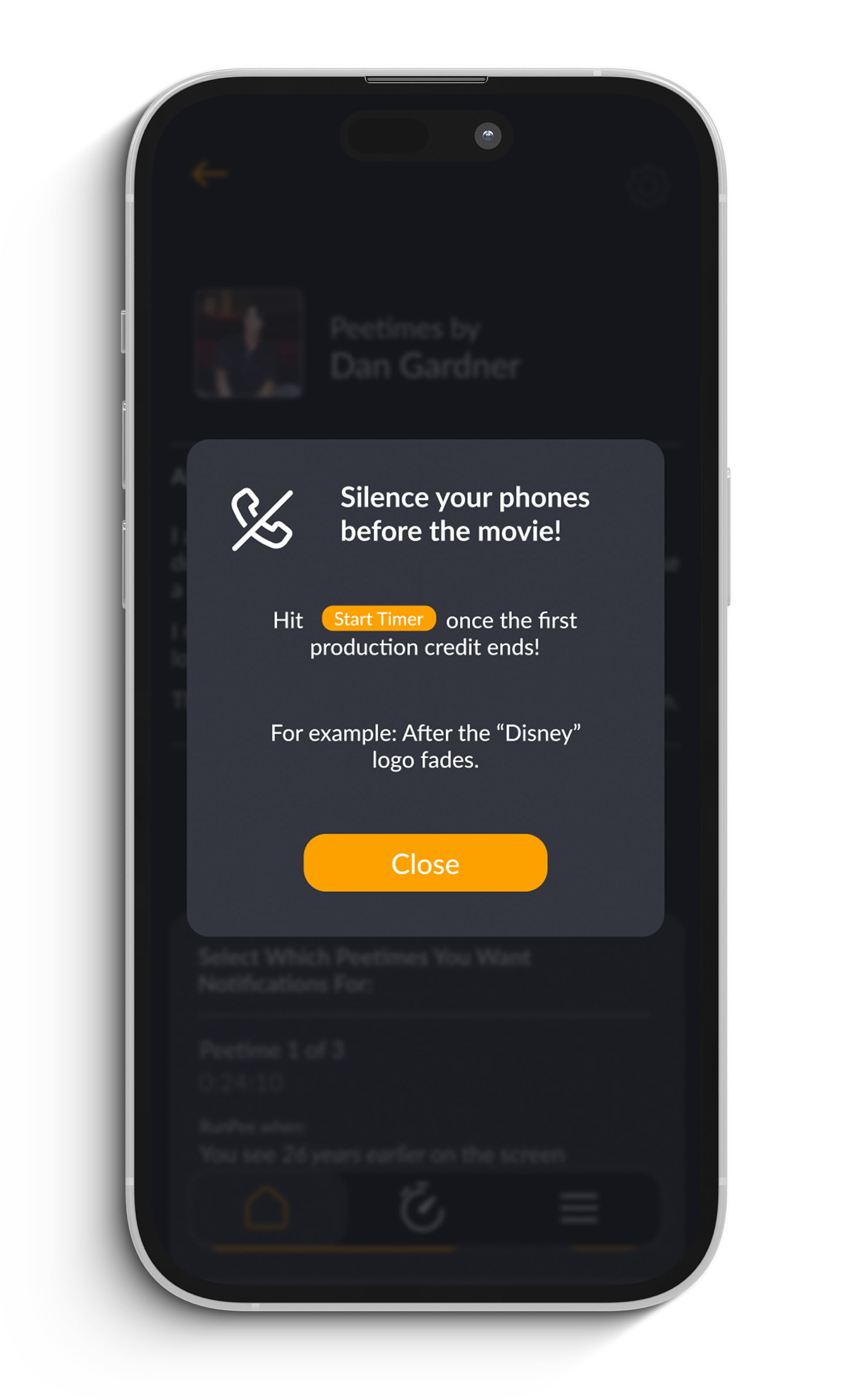
Redesigned Screens
Link to Prototype
https://www.figma.com/proto/mvK1YTWv7sHHqFou5RKzK6/Riley?node-id=692-1471&t=iZTVmsO9b5BVh8zh-1&scaling=scale-down&content-scaling=fixed&page-id=414%3A119
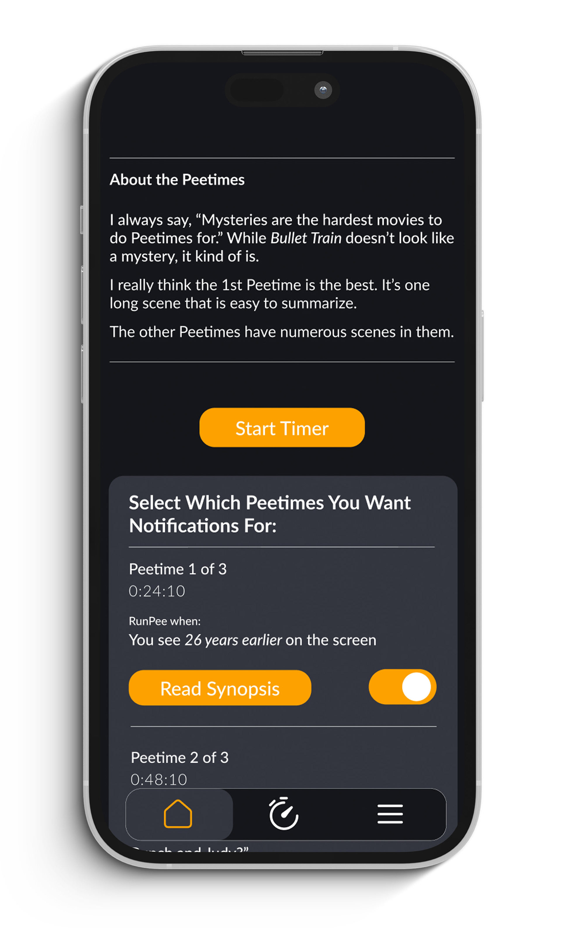
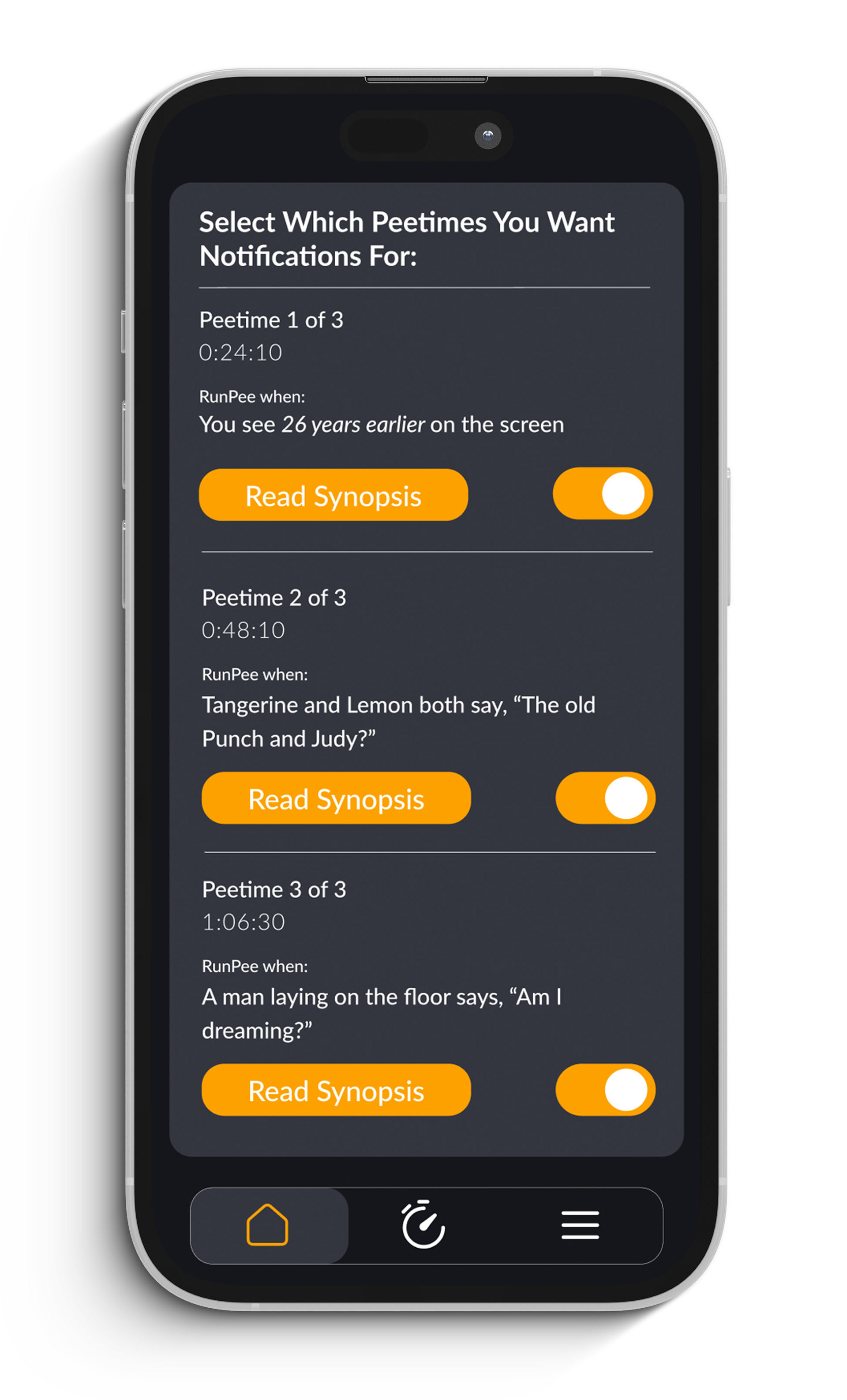
One thing I especially wanted to get right was making the notifications easy to use. Only two out of six users who tested the original product could find the notification page in the app. To do that I cleaned up the visual hierarchy and made sure buttons were clearly labeled.